Getting started with Google Looker Studio

Libraries Unlimited – The Lost Librarian, Photo © Nick Hook, March 2022
Using a visualisation tool is a great way to bring different data together to see how you are performing, if you’re on track to reach your objectives, and identify opportunities for change. There are a few platforms we regularly recommend at the Digital Culture Network, such as Tableau and Power BI, this article is all about getting set up and creating your first report in Looker Studio.
What is Looker Studio?
Looker Studio is a free online data visualisation tool, which can combine multiple data sets to create interactive and shareable reports. Originally, Looker Studio was called Google Data Studio and you will find many resources and guides under that name. Although it is now known as Looker Studio, the functionality and interface are exactly the same.
Back in June 2019, Google acquired Looker, a data cloud ecosystem, and has now merged their Google Cloud business intelligence (BI) products under the Looker name.
What data can I link to Looker Studio?
Almost anything. There are over 600 partner connectors for more than 800 data sources. Data sources could be your Facebook Insights, a CSV file, or Google Analytics for example. Connectors will automatically pull through live data from your current systems, removing the need to download reports from each system.
Google platforms, such as Google Analytics, YouTube and Google Ads have free connectors. For other platforms, paid connectors are available from Porter and Supermetrics, with some free connectors for Facebook Insights, Facebook Ads and Instagram through Gladior Data Hub.
Building your first report
The following step-by-step instructions will help you build your first report in Looker Studio using Google Analytics 4 (GA4) data. We look at how to link your data in and explore the different charts available to build a simple report showing total website users and web pages with the most views.
Note: On 7 November 2022, Google added a limit to the amount of requests Looker Studio can ask at one time. We recommend limiting the different charts on each page to ten.
Looker Studio is free to use, but you need a Google Account.
Make a Google Account (if you don’t have one)
When creating a new Google Account, there is an option to Use my current email address instead.
We recommend you create a Google Account using a shared inbox organisational email address (for example: [email protected]) and set this as the administrator of your different Google platforms. You can then add additional users at different permission levels (and remove them if they should ever leave).
To save yourself from future heartache, don’t use a shared Gmail account.
Log in to Looker Studio
Go to Looker Studio and log in with your Google Account. You will be presented with the Looker Studio homepage, this is where you will find any reports you create or are shared with you.
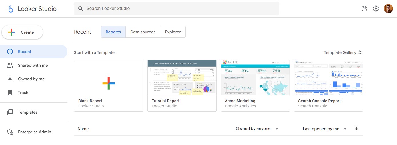
To create your first report, click the + Create button in the left navigation menu or + Blank Report from the templates. (You may be asked for additional information and to accept terms to complete your account setup in a popup).
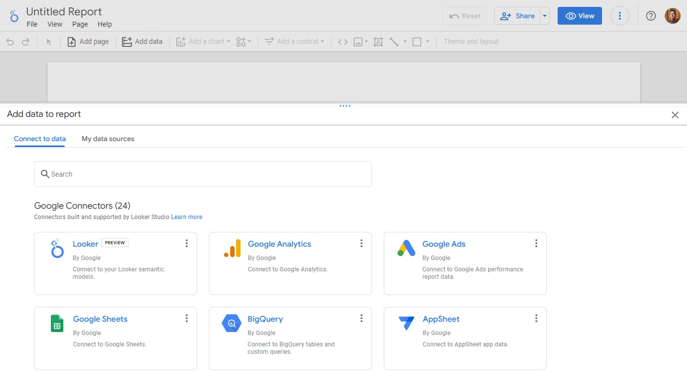
Linking your data
You will be asked to choose your data source for the report. Here is where you can choose from over 600 different connectors to link to your data set. Reports can have multiple data sources but you only need to choose one to begin with. In this example, we will choose Google Analytics.
You will be asked to authorise the connection to your Google Analytics account. The Google Account you are currently logged into also needs to have access to the Google Analytics account you wish to use as a data source. If you have just created a new Google Account you may need to add it in before this step. This video explains how to add new users to your Google Analytics account .
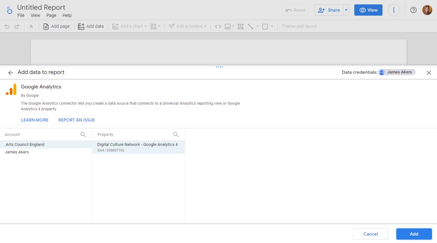
Choose the Google Analytics account and property from the list and click the Add button. There will be a notification popup, click Add to report to go to the next step.
Note: We are using Google Analytics 4 data for this example. If you only have Google Universal Analytics data you can still choose that as a source but the options and terminology will be different to what we cover below.
Rename your report
Looker Studio will create a blank page and place a chart on the page using some of the data from your source. Initially it will be called Untitled Report, to change it click the text and rename it to something suitable.
You are in edit mode which means you can add new charts, change the data they look at, and add new pages to your report. At the top is a View button, use this to switch between view and edit modes.
The View version of the report is what others would see if you were to share the report. They can interact with the charts and view different pages, but not make any changes at all.
Any changes you make in Edit mode are automatically saved and you can access the report again from the Looker Studio homepage.
Edit your first chart
In this example we are using Google Analytics 4 (GA4). The data available is split into Dimensions (the category) and Metrics (how many times something has happened).
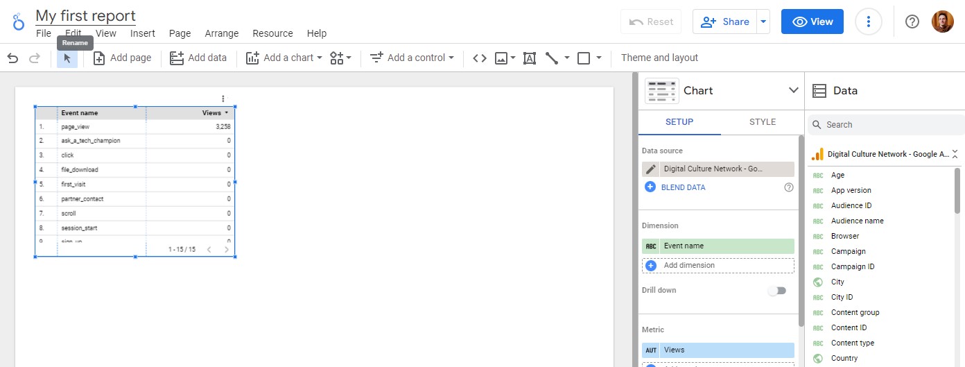
The chart, which is automatically added to the report, shows the different Events which have happened on your website (Events are how GA4 tracks user interactions such as File Downloads and Video Plays). Event name will automatically be added as the Dimension.
However, it will only show Views against the page_view Event in the list so we need to change this. (The Views metric is unique to the page_view Event, for other Events we need to count how many times they have occurred using the Event Count metric).
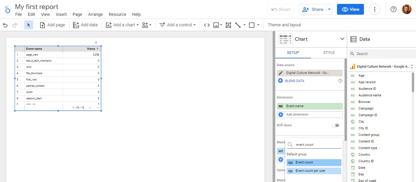
In the Chart Setup column on the right, click the Views selection under Metrics. Search for Event count and select it from the list.
This will update the chart to now show how many times each event has been counted.
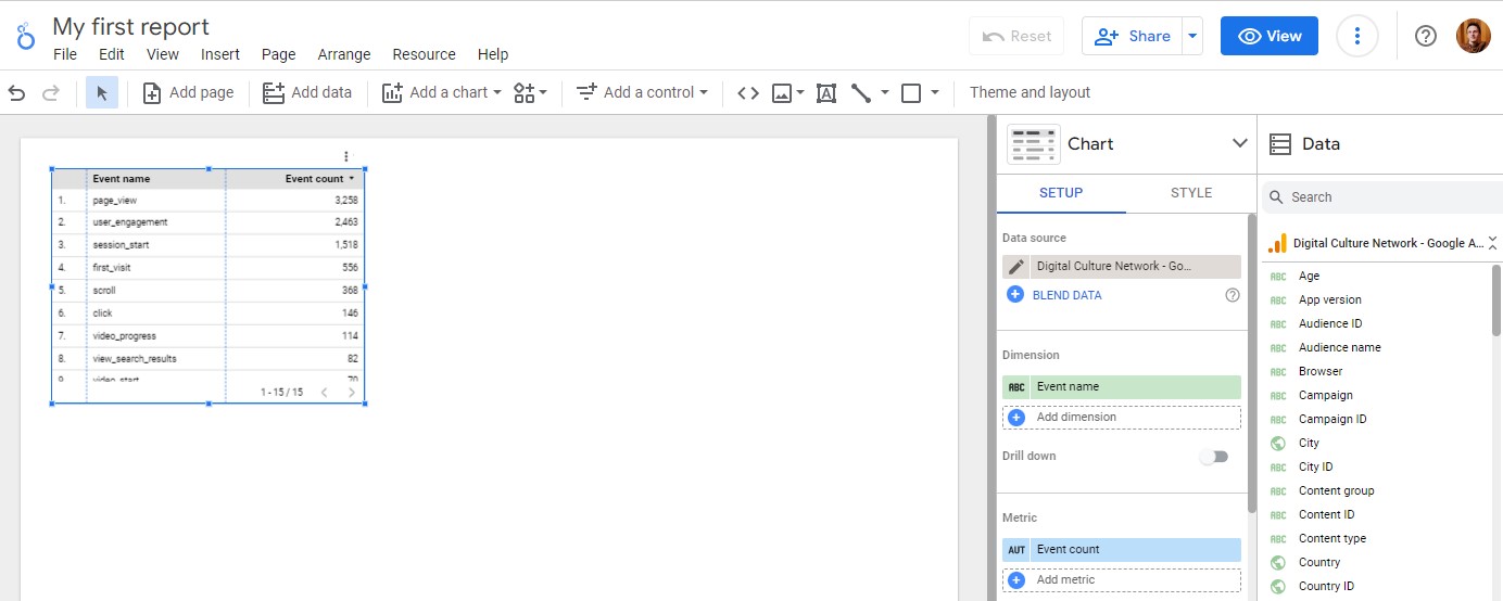
This list is the core data available from Google Analytics 4. There are additional Dimensions and Metrics which are passed as Parameters with information about your users and their actions.
In the next section, we will look at the different charts available and how to select the relevant data.
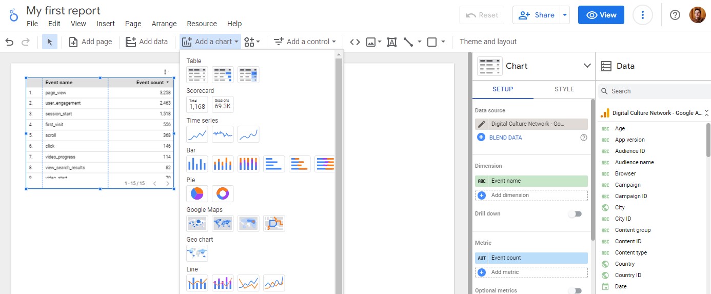
Looker Studio charts
The first chart added to your report was a Table. In the top menu navigation, you can add new charts to your page using Add a chart. In this list you will see the full range of charts available, and we recommend trying out the different types to match the data and the message you’re trying to convey or questions you’re trying to answer.
Add a Table
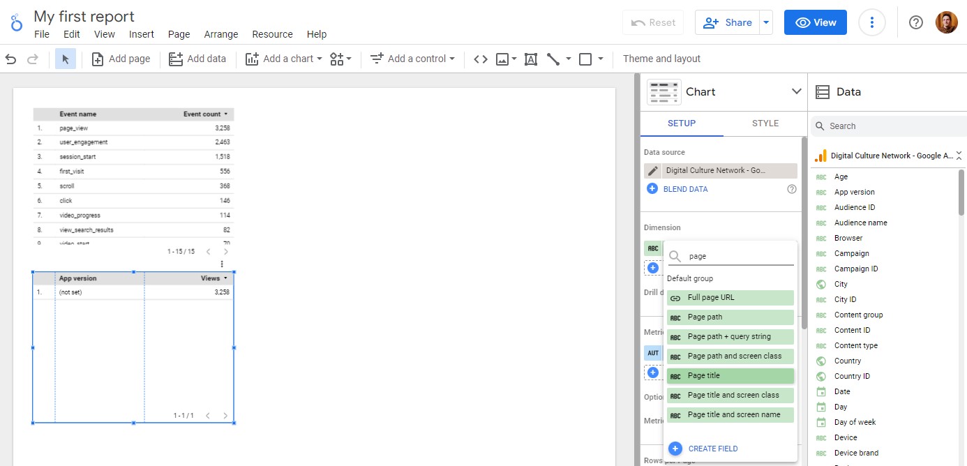
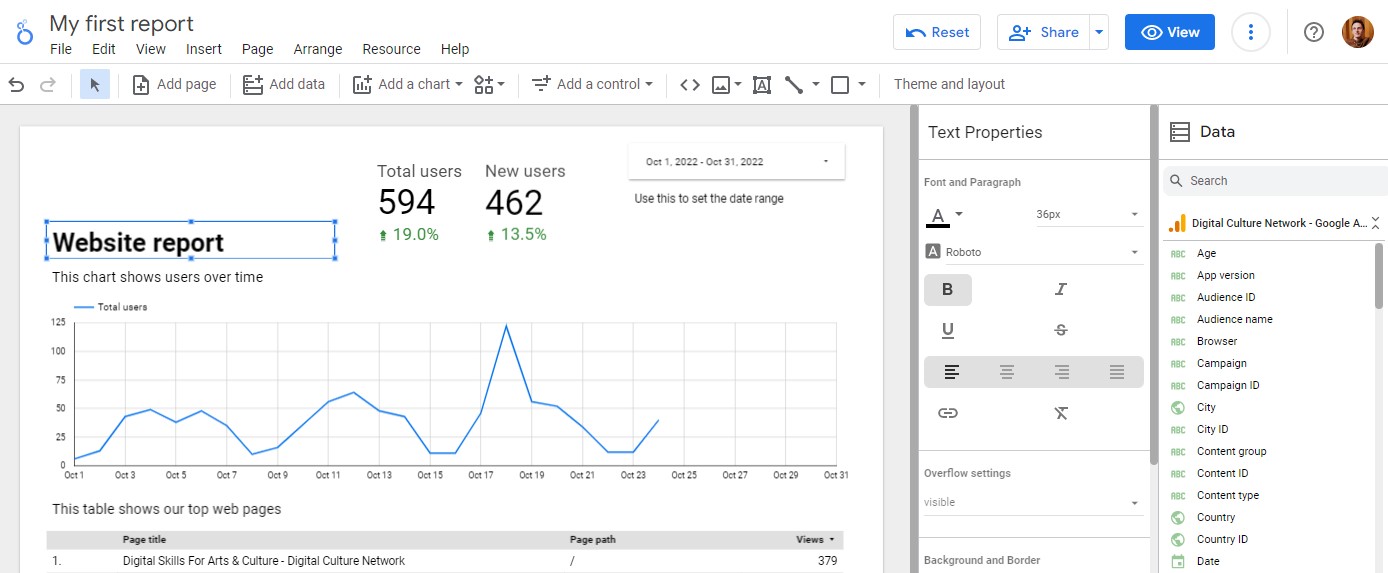
The Table chart is excellent at showing multiple lines of metrics in different rows and columns. Let’s create a table to show the most popular web pages on our website. From the Add a chart menu, click the first Table option and place the chart on your page.
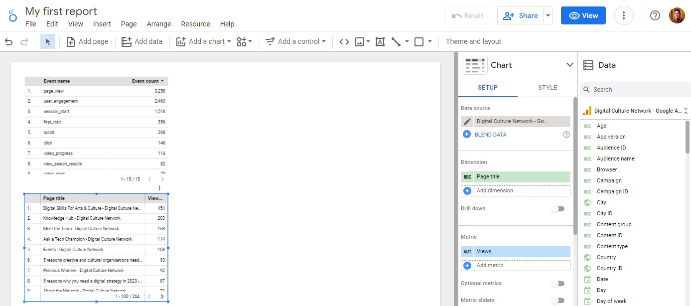
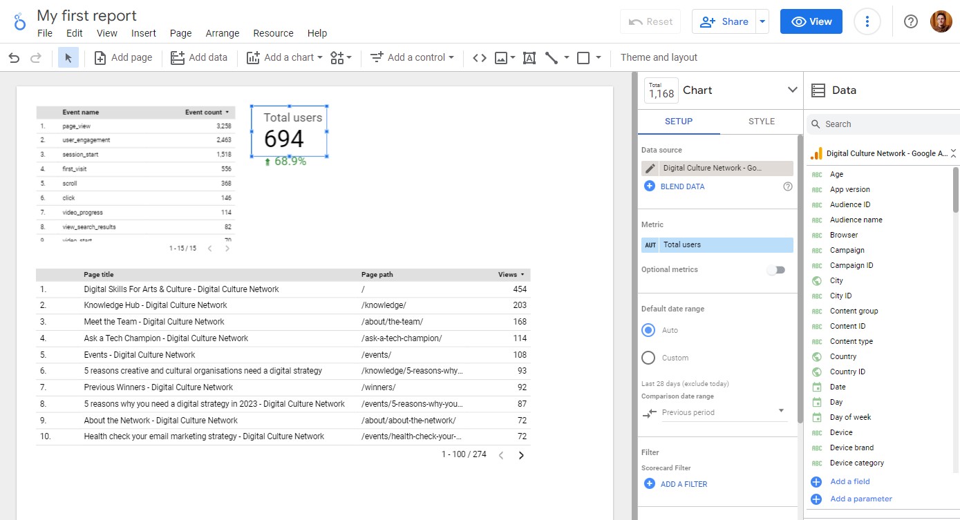
Under the Chart Setup column, change the Dimension to Page Title and Metric to Views.
This will update the Table to show a list of Page Titles and how many Views each page has received. We can adjust the Table to make the columns wider so we can read the full page name.
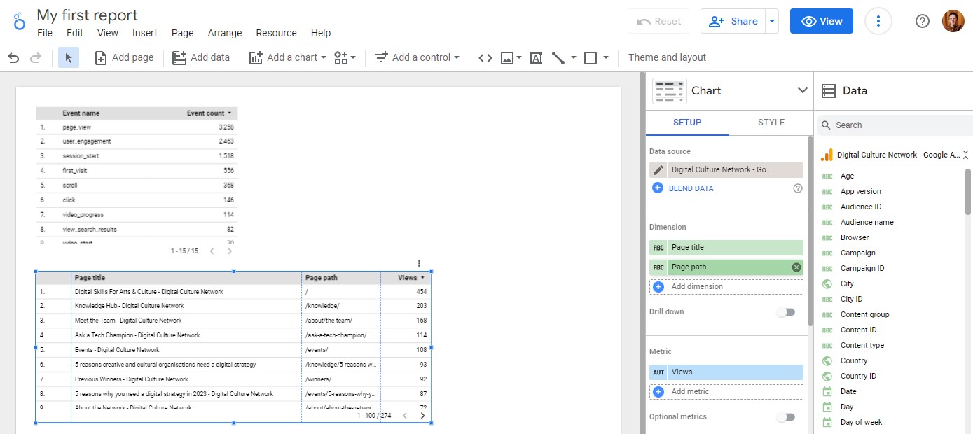
If we also wanted to see what URL each page was, we could add an additional dimension for Page path.
If you find it difficult to read any of the Dimensions or Metrics in the Table, you can change the font size in the Style tab under the Chart column.
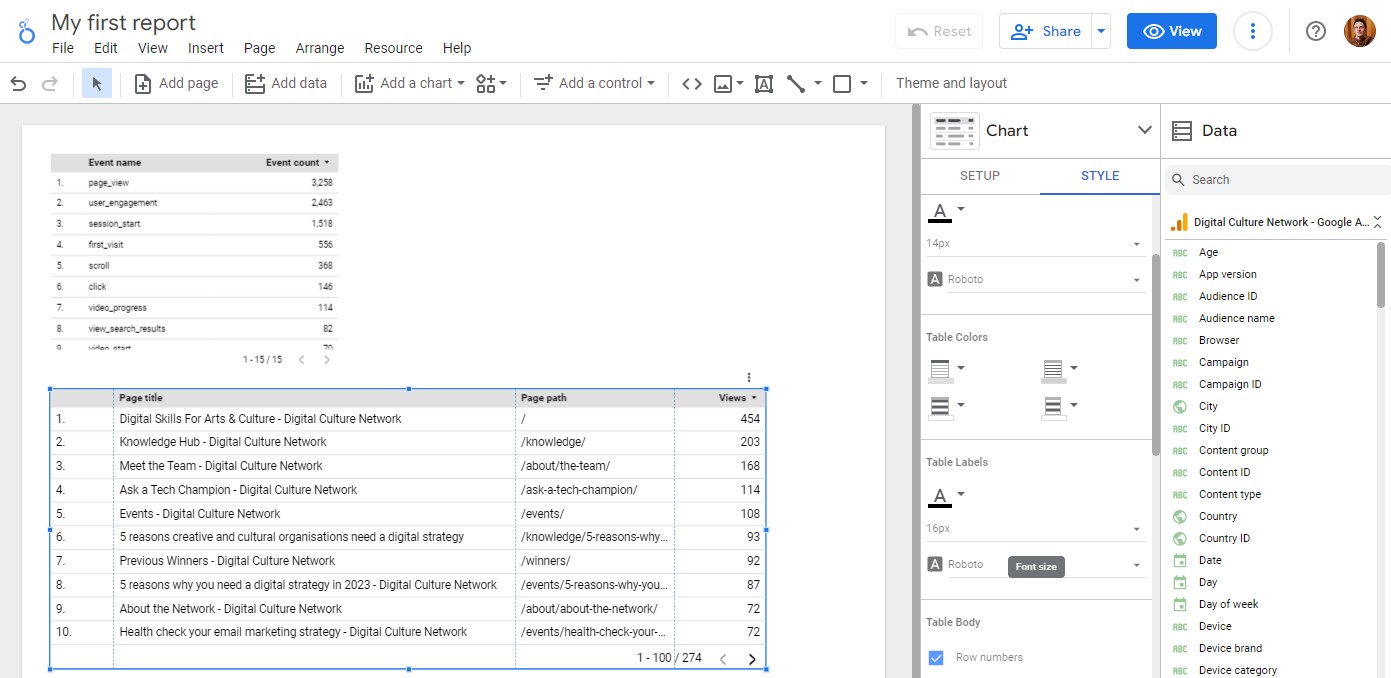
Here I have increased the Table Labels to 16px font size.
Add a Scorecard
A scorecard is great for displaying single Metrics as a big number. These could be the core objectives you like to track or top level numbers you wish to report on.
From the Add a chart menu, click the Scorecard option and place the chart on your page.
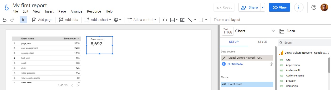
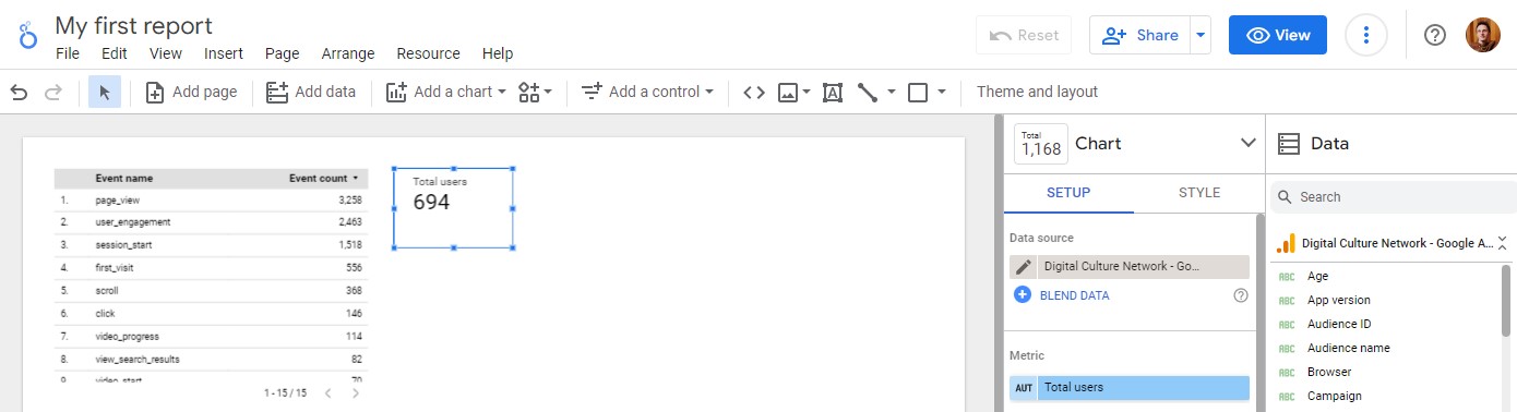
Looker Studio will automatically add the Event count Metric. This is not particularly useful, so let’s change this to Total Users. This is everyone who has visited your website.
In the Chart Setup column, we can choose a Comparison date range to show how this count is different to a previous period. There are options to pick a specific Fixed date range, the Previous period, the Previous year or select the Advanced range.
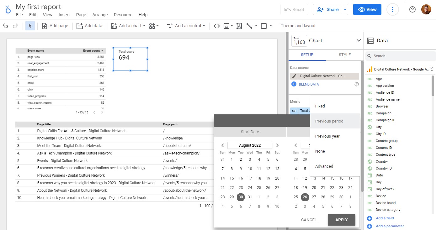
Click Apply and this will add a percentage number in green or red indicating if the number has increased or reduced. In the Style tab we can increase the font sizes to make it clearer.
If we wanted to replicate the Scorecard with the same size and comparison range, we can duplicate the current Scorecard and change the Metric. Select the Scorecard and use copy and paste shortcuts Ctrl+C and Ctrl+V (or right-click and use the options). It will place a duplicate Scorecard on the page which you can position using the automatic guides.
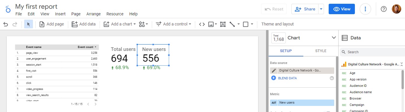
If we select New users as the Metric it will update the Scorecard. These are people who have visited your website for the first time using that specific device or browser.
Add a Time series chart
A Time series chart is great for displaying Metrics over multiple dates and presenting trends over time. From the Add a chart menu, click the Time series option and place the chart on your page.
We are running out of space on the page so let’s remove the first Table that was automatically added to the page. Select the Table and click delete (or right-click and choose delete from the menu). Anything you delete from Looker Studio will not affect your data source, so don’t worry about affecting your live data. You can now reposition the other charts on the page.
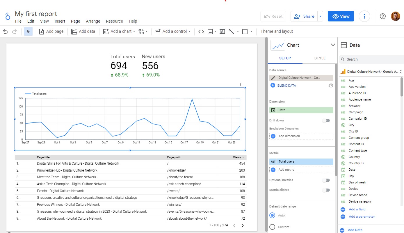
Our Time series chart shows Total users over time. The date range for all the charts on the page is set to Auto under the Default date range, which is 28 days. We can override this on an individual chart basis (for example a fixed financial year 1 April to 31 March), or we can use a Control to amend the date range which we will look at in the next section.
Other charts
We recommend playing around with the different charts with different Dimensions and Metrics to find the right fit. This article from Optimize Smart explains the different Dimensions and Metrics available in Google Analytics 4.
The Financial Times Visual Vocabulary is a really useful starting point for understanding which visualisations work for different data sets.
Although Pie charts are visually pleasing, they make it very hard to interpret and compare if you have more than two metrics. We recommend avoiding them as in most cases a bar chart is much better.
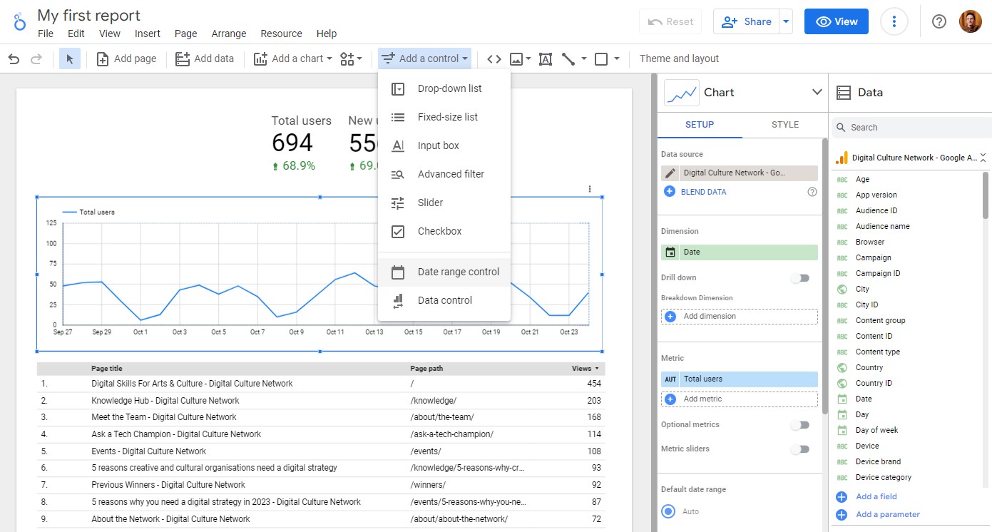
Interactive controls
Looker Studio controls allow you to add options for your report users to change and filter the data in the reports. A common and useful option is setting a date range control on a page. From the Add a control menu, click the Date range control option and place the control on your page.
Here you can set a specific date range or leave it at Auto (last 28 days). Users can interact with this control to set the required date range and it will update every chart on the page (if they are set to Auto date range). 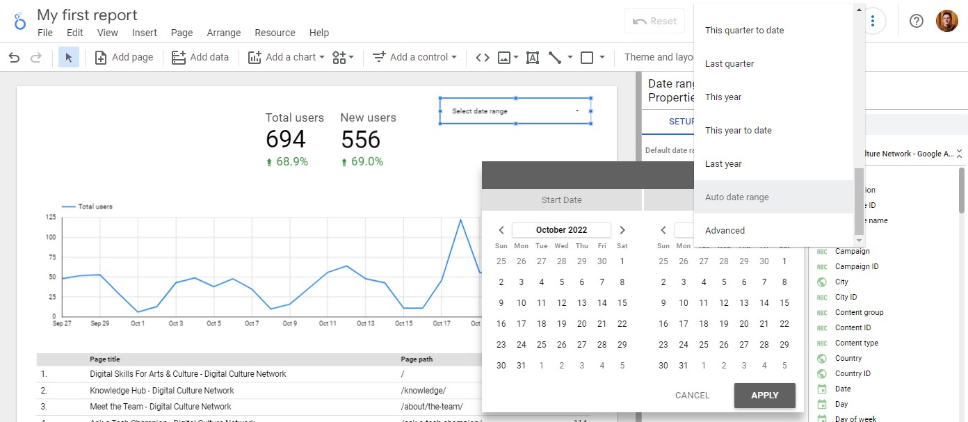
If you click the View button at the top of the page, you can try out the report as a user.
Style and branding
One of the main benefits of using a data visualisation tool such as Looker Studio is the ability to fully customise the placement and style of the reports. Reports can include additional text to explain the data, charts’ colours can be amended to highlight key statistics, and your logo can be added to match your brand.
Adding text
Text boxes in reports are brilliant at setting the scene, explaining what people are looking at and giving directions on how to use interactive features. You can add text to the page using the menu option (icon with A in a square).
Changing the colours
We recommend leaving this to the very end, it’s easy to get distracted and carried away with colours and logos. Focus on building your report with the right charts first, and add styling last!
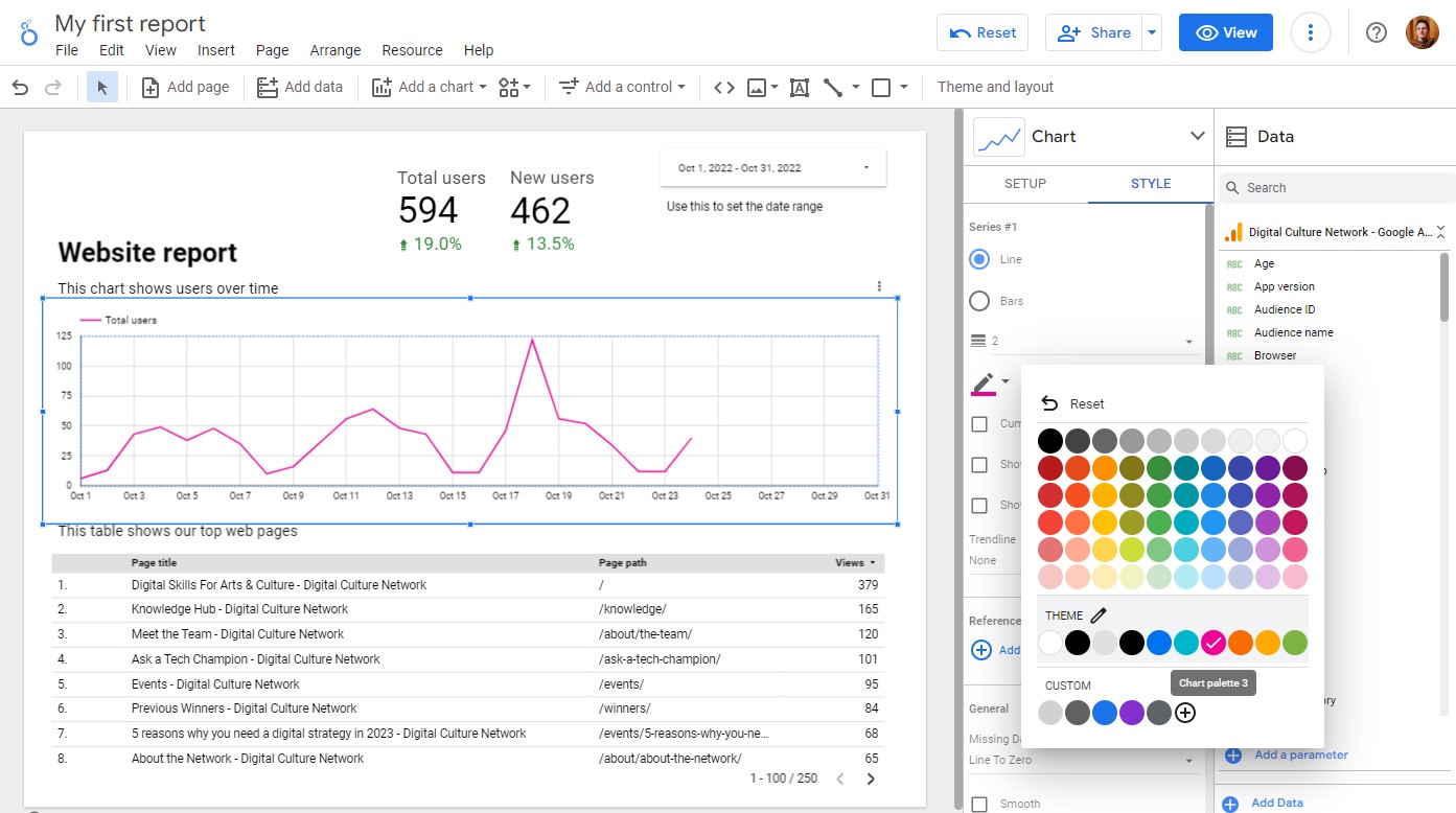
Styles can be set at different levels (for example the background colour can be set for the whole report). For this example, we will change the colour of the Time series chart. Select the chart and the Style tab from the Chart column.
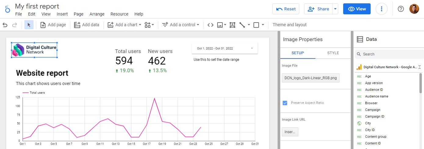
Adding a logo
To add a logo to the report you can Upload from your computer or by URL from the picture icon in the menu, or drag and drop an image onto the page.
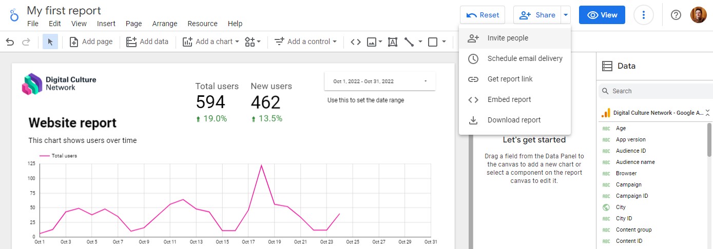
Sharing your report
When you are happy with your report, it’s time to share it with your internal teams or external stakeholders. Looker Studio gives you full control over who can view your report and can limit what they do (for example, preventing downloads).
The share options are at the top of the page. Here you can invite specific people to View or Edit (they will need a Google Account), create a shareable View link, set up a scheduled email of the report, get code to embed the report in a web page (if you have turned this functionality on under File > Embed Report), or simply download it as a PDF.
Next steps with Looker Studio
Now that you have created your first report using Google Analytics 4 data you can play around with the different charts and functionality (you can’t break anything!).
In this article we have only scratched the surface of what Looker Studio can do, we will release further resources looking at multi-page reports, combining sources and manipulating data.
If you do need help at any point, please see below on how you get in touch.
Further Support
The Digital Culture Network is here to support you and your organisation. Our Tech Champions can provide free 1-2-1 support to all arts and cultural organisations who are in receipt of, or eligible for, Arts Council England funding.
Need help or would like to chat with us about any of the advice we have covered above?
Request a free 1-2-1
To be the first to hear when new events are available and get the latest news from the Digital Culture Network, sign up for our newsletter below and follow us on Twitter @ace_dcn and LinkedIn for the latest updates.