How to audit your eCommerce website and improve your customer journey
This article accompanies and complements the webinar of the same title presented by Tech Champion Katherine Brown on January 19th, 2023. A recording of this webinar can be viewed here.
In this article, we explain what the customer journey is and how it can be used to structure an audit of your eCommerce website. If you are familiar with the concept of the customer journey – do skip ahead to the useful audit checklist we have compiled for you!
What is a customer journey?
Whether a customer is shopping in a physical shop or online, there is a sequence of steps that a customer takes on their path to making a purchase. In a physical shop the ‘customer journey’ might go something like this:
- Enter the shop.
- Look around.
- Pick up an item, look at the price, put the item down.
- Move to a different area of the shop.
- Pick up another item.
- Ask a sales assistant a question about the item.
- Take the item to the till.
- Pay for the item.
- Take the item home.
Clearly, between steps 2 and 7 a customer might look at many items and this could be quite a long sequence. In a shop environment customers can physically move around to see the products on sale and they benefit from being able to touch and feel items. Shops are very information-rich environments – even the quality of the shop fittings, the attitude of the staff, and even the smell – will help a customer make their buying decisions.
When we are thinking about the online customer journey, our website has to do a lot of work to convince customers at each stage of the journey as we do not have those same physical signals. Further, when we shop online our items are delivered to us by post – this introduces a whole additional area of uncertainty for the customer. How much will it cost? How long will it take? etc. In our online customer journey, we will be seeking to minimise and eliminate this uncertainty throughout the journey.
With that in mind, it is helpful to look in more detail at the online customer journey.
How can we break down the online customer journey?
We can break the online customer journey down into five clear stages, which we can think of as the A, B, C, C, D of the journey – Arrive, Browse, Consider, Convert, Deliver. This is shown as a funnel as many more people visit our website, than actually make a purchase – our aim is to get as many people as possible to the final stage of placing an order.
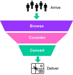
Arrive: Customers arrive at your eCommerce site as a result of your marketing efforts. Here we want to consider if our eCommerce site is accessible, responsive, and fast. The digital equivalent of having the doors open and the lights on!
Browse: Customers browse your range of products. They may be looking for something in particular, or they may be looking for inspiration. Either way, the aim at this point in the customer journey is to show your customer relevant products. The key elements of your eCommerce site which influence the browsing experience are:
- Stock availability
- Search functionality
- Navigation Menu
- Homepage Banners
- Category Pages
Consider: Customers look at specific products and consider whether they meet their buying criteria. Here our aim is to provide maximum product information to eliminate any buyer uncertainty. We also want to highlight the quality and provenance of our products. Unsurprisingly a Product Page with great imagery and descriptions is key to doing this. What is important to be aware of at this point, is that the issue of Delivery is likely to float into the customer’s mind and will be a key consideration for them. As a result, the key elements of the ‘Consider’ stage of the journey are the double act of:
- Product Page
- Delivery Information
Convert: The ‘convert’ stage of the customer journey is the gauntlet running from the product page to a successfully placed order. Our aim here is to make it as little like an obstacle course as possible, and make sure that the path is clearly sign-posted with relevant information throughout. The key elements we will audit are:
- Product Page
- Basket
- Checkout
Deliver: Once an order has been successfully placed by the customer, the journey is not over! In fact, there are many post-purchase interactions between you and your customer, and our aim is to ensure they have a positive and memorable experience. We do this by managing expectations and communicating our brand personality. By doing this well we encourage our customers to return in future. The elements we will audit are:
- Order confirmation page
- Order confirmation email
- Dispatch email
- Packing note
- Packaging
How to audit the ‘Arrive’ stage of the customer journey?
- How fast is your site?
Users do not like to wait around for a page to load. In fact, many will not – the slower your site is, the more potential customers you will lose.
There are several free online tools that will give you an indication of how fast your website loads and will highlight particular issues that might be slowing your site down.
Generally speaking, a site speed that loads in less than 2 seconds is considered very good, and anything over 5 seconds is considered slow. And unsurprisingly the faster the better! Multiple studies have found this can have a significant effect on conversion rates.
These tools can go into quite a lot of technical detail, but even if you are not a technical person, they will draw attention to any red flags that should be addressed.
https://gtmetrix.com/ – offers user-friendly visualisation.
https://tools.pingdom.com/ – offers the ability to test from different geographic locations.
- Is your site device-friendly?
Users may access your site from mobile, tablet or desktop machine. It is important to make sure your site is accessible to all of these devices.
Helpfully there are some great free online tools from Google that will identify if there are any red flags when loading from different devices.
https://search.google.com/test/mobile-friendly – will check if your site is mobile friendly
https://pagespeed.web.dev/ – offers insight on loading experience on mobile and desktop
- Link from Main Organisation homepage
For most cultural and creative organisations and individuals, their eCommerce site will be part of their broader operations as an organisation or an individual. An incredibly important ‘route’ into the online shop is via a link from your organisation’s homepage.
Ideally, this should be on the main navigation menu or in a standalone prominent place.
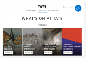
Tate website
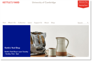
Kettle’s Yard website
- Human accessibility
Making web design more accessible for people with different needs is a broad topic and if you have not actively considered it as an organisation previously, it is well worth investigating more thoroughly. Here are the fundamentals that underpin this area:
- Avoid moving, flashing images.
- Check your colour contrast. Strong visual contrast is important to make sites as accessible as possible to those with visual impairment and also makes your site easier to use in poor-lighting conditions – for example, outside on a mobile device in bright sunshine.
Use tools such as WebAim to check pairs of colours and A11y to check whole web pages.
- Make sure your site is screen-reader friendly. Many visually-impaired people use screen readers to access online content and where they encounter an image, they will look at the ‘alt-text’ field in order to provide the user with a description of the image. If this field has not been completed, the user will have no way of knowing what the image means.
Do some spot checks on images on your website to see if they have associated alt-text. Browse your website using Google Chrome, right-click on an image, and choose ‘Inspect’ from the dropdown menu. A box of code, will appear onscreen and the block highlighted in blue is associated with the image you right-clicked on. Look in this blue highlighted block to see if there is a field called ‘alt’ and what has been entered for it.
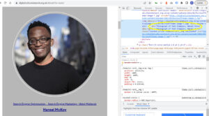
Example of the alt text spot-check.
How to audit the ‘browse’ stage of the customer journey?
- Test your ‘Search’ box
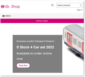
London Transport Museum shop website
- Are customers able to use a ‘search box’ to find items they might be looking for? Does this have a clear prominent position on your pages?
- Test your search box – enter some things which you imagine a customer might be looking for and see if you get sensible results. Are all the products you want to show up, showing up for your query?
- Look at search query data – what are your users looking for? If possible, get into the habit of checking this weekly – it will give you a feel for the seasonal interests of your users.
- In your search query data – look to see if there are any search queries that return ‘no results’. If so, in the backend of your eCommerce/onsite-search provider, look at manually assigning products to these queries.
- Check your navigation menu
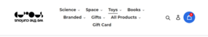
- Does your navigation menu have a clear prominent design?
- Do you use shopper-friendly language to identify your range?
- Do you highlight seasonal or topical items?
- Is it possible to reach all of your products?
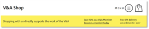
The V&A Shop web page uses colour to highlight which part of the navigation menu is open. Clear language is used to identify a broad range of product categories and seasonal items are highlighted for Christmas and from recent Exhibitions.
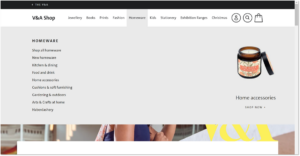
The V&A Shop website
The Tank Museum Shop highlights particular categories which speak to their audience, such as ‘modelling’, on the Navigation. They are also using ‘New In’ and ‘Clearance’ to highlight seasonal offers.
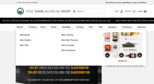
The Tank Museum Shop website
- Check how effectively you ‘surface’ products on your eCommerce homepage.
Beyond the search box and navigation menu, you can use ‘banners’ to help users find inspiring and compelling products on your site. They are important as not all users know what they are looking for and they are visually engaging ways of drawing users into the customer journey.
The Tate Shop combines a strong image, clear text description, and a call-to-action button to make excellent homepage banners.
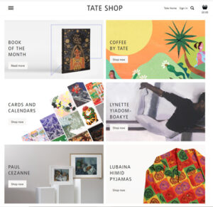
Tate Shop website
John Lewis uses banners in a very dense manner, to provide a lot of routes into different product areas. Above the fold, there are banners presenting 10 different product areas for the user to consider!
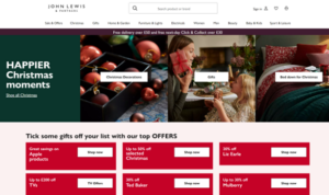
John Lewis website
Check how many product routes you surface on your eCommerce homepage!
- Review your category pages
Whether following a navigation menu or a banner your user will reach a ‘category page’. A category page offers a choice of products and our aim is to get the user to click on a product and continue the customer journey. We do this by making sure we have compelling category pages
- Make sure you are offering your customers a choice of products. A category page should have a minimum of 3 to 4 products.
- Make sure images are illustrative and appealing. By illustrative we mean an image that gives a clear indication of the product – rather than says a close-up image!
- Make sure your prices are clear.
- Display best-selling items first on the product page.
- Offer users the ability to ‘sort by price’ / bestselling/ new in etc.
- Make sure there is some text content on the category page. Generally, this is an SEO concern and will ensure your category pages rank well with Google, but this text can also be useful to customers, framing where they are on this site.
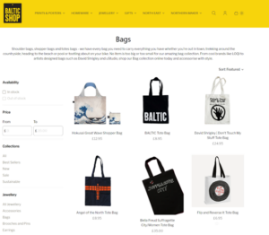
Baltic Shop website
How to audit the ‘consider’ stage of the customer journey?
This is all about the Product Page providing enough information to the user to convince them to continue with the next stage of the customer journey. Make sure your Product Page has all of the following:
- Do you have good imagery?
Your product page should have multiple images of the product. These should aim to:
- Show how a person would use the item. Obviously, if it is an item of clothing or accessory having a person model the item can really help. Having hands, a model, or some kind of human interaction in the photography helps shoppers relate to the item. (An aside if you ever watch a shopping TV channel, you will see how much the camera focuses on the presenters’ hands handling the item – this is not chance, it is a known sales technique!)
- Show the item in a tactile setting – eg on a wooden table, or other appealing surfaces. Using textures in photography can help evoke the tactile experience of in-store shopping. Think about how your imagery can reflect the brand and tone of your organisation.
- Give a sense of scale – including items of a known size will help with this e.g. cutlery, mug, phone, in a room. For artwork, there are apps like Canvy which will allow you to virtually mock-up what a piece would look like in a particular setting.
- Provide a high-quality, zoom-in image. Users like to be able to look up close and get a real feel for what those materials may be and the quality of the finish.
- Is your price clear?
Sounds quite simple to make sure your price is clearly displayed on the product page. In practice this means:
- A prominent position above-the-fold on all devices. This means it is visible without the user needing to scroll to find it.
- In a large font, with a strong colour contrast against the background.
- Is your description helpful?
Online customers cannot inspect the item themselves so rely on the images and text description to make their decisions. Your description needs to remove any possible uncertainties and must include:
- Short description of what it is and how it is used.
- Dimensions and weights. Be specific, make it clear what the units and measurements are.
- Again be specific and provide as much information as possible.
Your description could also include:
- Why you love this item. How it relates to your organisation’s mission.
- The provenance of the item – is there additional information you could provide about the maker or artist or region it comes from?
- Do you provide links to Related Items?
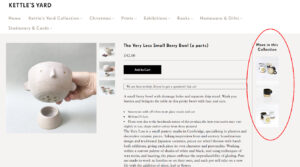
Kettle’s Yard website
A product may not be quite what a user is looking for, but by looking at a particular product page, they have given a strong indication of what they might be interested in. We can take advantage of that information and make sure we show links to ‘related products’ so they can continue their consideration journey.
- Is your Delivery Information easy to find?
The elephant in the room is the price of delivery. On the Product Page, make it quick and easy to find out how much delivery will cost and how long it will take. This will help eliminate customer uncertainty and doubts. If you offer Free Delivery, highlight how much you have to spend in order to qualify. There are several ways you can do this on the product page.
- Make use of sitewide banners to highlight Free Delivery
- Near the product price, provide a link to a ‘Delivery’ page that outlines your delivery offer.
We the curious website
- Or you may choose to provide more detailed Delivery information on the product page.
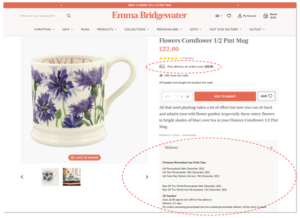
Emma Bridgewater website
- Always ensure you also have a link to your Delivery page from your footer, so it is accessible at all points in the customer journey.
- Advanced functionality to improve your product page.
There are many other ways of super-charging a product page that large retailers often use. These include:
- Collecting customers’ product reviews – this can have a massive impact on conversion rates and there are now many systems to choose from.
- Using social proof – such as indicating how many other customers have looked at or bought an item recently. Depending on how this is worded it can either create a sense of reassurance – ‘other people have trusted this item/site’ or a sense of urgency.
- Adding virtual assistants who can answer customer questions – these may be powered by a chatbot or may have a real human being answering behind the scenes.
If your organisation is interested in exploring these, the DCN is ready to support you!
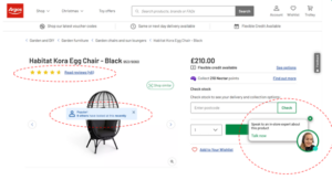
Argos website
How to audit the ‘Convert’ stage of the customer journey?
The ‘Convert’ stage of the customer journey is all about ensuring there is a clear progression from the Product Page to Basket to Checkout to Order Confirmation. Here is what you need to check at each of these stages:
- Is your ‘Buy Button’ obvious?
- This needs to be clear and obvious on the Product Page.
- It should be above-the-fold – i.e. the user does not need to scroll to find it.
- It should be in a strong visual contrast colour.
- It should have a clear Call-to-Action button such as ‘Buy Now’ or ‘Add to Basket’.
- On pressing the ‘buy button’ the user should be informed that the item is added to their basket.
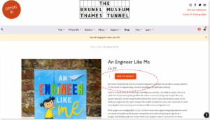
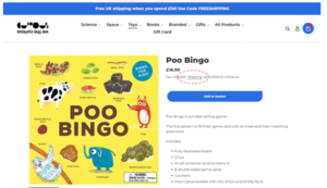
The Brunel Museum website
- Is your basket easy to access?
- This should be accessible sitewide in the site header via a basket indicator. This means that whatever page of your site a user is on, they can reach their basket.
- The basket indicator in the site header should show when items have been added to the basket. This subtly lets the user know that there is a next step that can be taken. Sometimes this is shown with a coloured dot, or a number of items in the basket.
We the curious website
The V&A Shop website

Emma Bridgewater website
- Does your Basket page provide clear information?
For the best conversion rates, the basket page needs to clearly show the following information:
- Item prices and total cost.
- Cost of delivery – some eCommerce platforms calculate this at a later stage in the checkout, and if this is the case you should at least provide a link to your Delivery Page so users can easily check potential costs.
- Whether an order is eligible for Free Delivery. If an order does qualify for Free Delivery – highlight this! If it does not indicate how much more needs to be spent in order to qualify.
- Payment methods accepted. This means users do not have to wait until part-way through checkout to discover what payment options are available.
- A clear call-to-action button indicating ‘checkout now’ or similar.
- You may want to consider adding an additional conversion message relating to your organisation’s mission.
- You may choose to promote additional items for sale in the basket, such as membership.
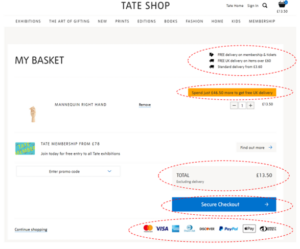
Tate Shop website
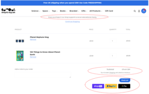
We the curious website
- Is your Checkout streamlined for conversion?
During the checkout, the mission is to collect the final two pieces of information from the customer – their delivery details and their payment details. The structure of checkout flows can be quite tied to the eCommerce platform you use, but broadly it should follow these principles:
- Ask for as little info as possible.
- Remove distractions – this means removing navigation menus and footers from view. This is standard practice in most eCommerce platforms.
- Provide helpful error messages – these should visually indicate any errors in a customer’s information. Test your checkout page by entering the wrong data in the wrong fields – how helpful are the visual alerts you get?
- Show stage in the checkout. By providing a progress indicator, users are aware of how close to completing checkout they are.
- Clear call-to-action buttons. Make sure the buttons you want your customers to press are clear and obvious!
How to audit the ‘deliver’ stage of the customer journey?
Once your customer has placed an order, things are just getting started. An order triggers off a series of post-transaction interactions with your customer. These are:
- Receiving an Order Confirmation email.
- Receiving an Order Dispatch email.
- Receiving the order itself – packed and with a packing note.
It is important to check that customers are kept fully informed and expectations are managed through this process. This is done by ensuring each of the post-transaction interactions listed above:
- Provides a clear record of order details.
- Sets expectations on order dispatch, order delivery times, email communications
- Signposts ‘help’ or customer service.
- Communicates personality and brand – to create a memorable, positive experience.
The London Underground Museum shop is clearly addressing expectations around delivery and access to customer support. They include information about email communication, the customer service team, and potential delays in delivery due to Royal Mail strikes. There is perhaps room to inject more ‘brand’ personality but they are incentivising future purchases by providing a discount code.
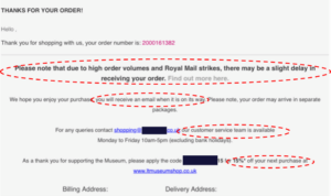
The London Underground Museum shop website
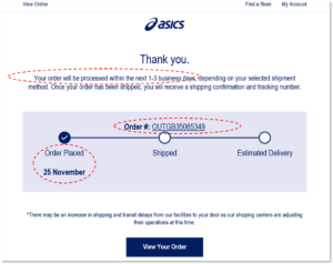
Looking to the commercial sector, Asics is an example of order confirmation with stronger branding, and again managing customer expectations around delivery timings. They include the order number, and provide a timeline for the order journey,
In summary
This article has used the customer journey to guide an audit of your organisation’s eCommerce website. Following this approach, you should be able to identify opportunities to improve your customer journey and grow online revenue. If you are keen to explore any of these areas in more detail or are looking for further support in improving your eCommerce experience do get in touch with the Digital Culture Network for some 1-to-1 support for your organisation.
What’s next?
The Digital Culture Network is here to support you or your organisation. Our Tech Champions can provide free 1-2-1 support to all creative and cultural individuals and organisations who are in receipt of, or eligible for, Arts Council England funding. If you need help or would like to chat with us about any of the advice we have covered above, please get in touch. Sign up to our newsletter below and follow us on Twitter @ace_dcn and LinkedIn for the latest updates.