Ten Excel tricks to speed up your reporting

Upload Unplug, Pell Ensemble at Frequency Festival 2019. Photo credit: Electric Egg
Reporting is a necessary requirement for all marketers, at all levels. From managing your datasets to arranging tables and charts. Reporting can often take up a sizable chunk of your time each month, quarter or year. So, if you are looking for time-saving tips, please read on.
Excel is the go-to tool for most marketers and data analysts. Excel is arguably the most powerful software at sorting data into meaningful categories, allowing you to identify trends and opportunities more easily. If you dig deep enough there is a quick fix to speed up any process in Excel, so without further ado, here are ten functions, formulas and shortcuts to try next time you are manipulating your metrics:
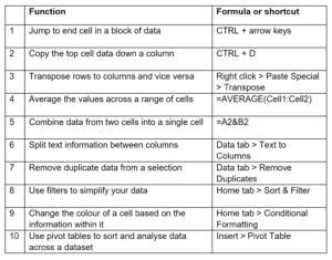
Continue reading for examples of how these Excel functions, formulas and shortcuts will help you automate calculations and save you time on tasks.
How to jump to the end cell in a block of data.
In terms of time-saving, this simple shortcut punches well above its weight. Holding CTRL + arrow keys will ‘jump’ you to the end cell in any block of data.
Imagine you have a data set containing 20,000 rows and you want to get to the bottom cell instantly. Instead of having to scroll down using your mouse, trackpad, or the side bar, simply click the top cell in any column and hit CTRL + down arrow, this transports you to the very bottom of the list. If you want to go back to the top, simply hit CTRL + up arrow. The same applies to scanning across columns using the left and right arrows. Happy days!
How to copy the top cell data down a column.
My personal favourite shortcut and one that has made using Excel so much less painful . This shortcut is best used when you are looking to copy information in a cell down a long list in a column.
The first step is to click on the cell you wish to copy and use CTRL + arrow to ‘jump’ to the end of your selection. Next, type any letter into the end cell (I habitually use an ‘X’) and use CTRL + SHIFT + up arrow to select across the entire range. Finally, hit CTRL + D and as if by magic the entire range will be populated. It takes a bit of practice to start with, but once the muscle memory is there, you will not go back to dragging out the corner of a cell.
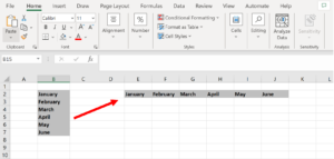
How to transpose rows into columns.
When you have rows of data in your spreadsheet, you might decide you want to transform the items in one of those rows into columns or vice versa. It would take a lot of time to copy and paste each individual header – but the transpose feature allows you to flip the axis and turn your rows into columns, or the other way around.
First, highlight the column that you want to transpose into rows. Right-click it, and then select Copy. Next, select the cells on your spreadsheet where you want your first row or column to begin. Right-click on the cell, and then select Paste Special. A module will appear and at the bottom you will see an option to Transpose. Check that box and select OK. Your column will now be transferred to a row or vice versa.
How to average the values across a range of cells.
The following formula is one of the default functions in Excel and a remarkably useful one when thinking about ways to speed up your marketing reporting. If you want the average of a set of numbers you can use the formula =AVERAGE(Cell1:Cell2). Equally, if you want to sum up a column of numbers you can use the formula =SUM(Cell1:Cell2). On a similar theme, you can toggle the status bar at the bottom right of the screen to display ‘Average’ and ‘Sum’ metrics across a selection of cells.
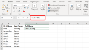
How to combine cells using ‘&’.
Databases tend to split out data to make it as exact as possible. For example, instead of having a column that shows a person’s full name, a database might have the data as a first name and then a last name in separate columns.
The formula to combine cells containing different data into one cell is: =A2&B2
To achieve the example given above, first put your cursor in the blank cell where you want the full name to appear. Next, highlight the cell that contains a first name, type in & and then highlight a cell with the corresponding last name.
PRO TIP: If all you type in is =A2&B2, then there will not be a space between the person’s first name and last name. To add a space, use the function =A2&” “&B2. The quotation marks tell Excel to put a space in between the first and last name.
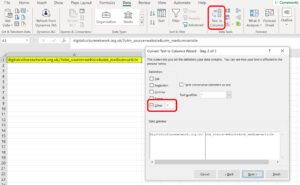
How to split up text information between columns.
What if you want to split the information that is in one cell into two different cells? For this example imagine you want to separate a UTM code from a website address.

- We want to take this: digitalculturenetwork.org.uk/?utm_source=webiste&utm_medium=article
- And be left with this: digitalculturenetwork.org.uk/
- By removing this: utm_source=webiste&utm_medium=article
Here is the process. First, highlight the column that you want to split up. Next, go to the Data tab and select Text to Columns. When the module appears select Delimited. ‘Delimited’ means you want to break up the column based on any special character you assign. For this example, input the ? as the delimiter to split the web address and UTM code into two parts. Once selected, Excel will show you a preview of what your new columns will look like. If the original text has been correctly separated, simply click ‘Finish’. You will be left with a new column for each part of the text allowing you to manipulate them as you wish.
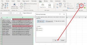
How to remove duplicate data.
Larger datasets often contain duplicate content. In situations like this, being able to remove duplicates with the click of a button is extremely useful. This method is far more reliable than the painstaking process of doing it manually. For example, if you think you have a list containing identical email addresses and you only want to see one, you can select the whole dataset and then remove duplicates. The updated list will now only display unique email addresses. Bingo!
To remove your duplicates, highlight the row or column that you want to remove duplicates from. Then go to the Data tab and select Remove Duplicates. A pop-up will appear to confirm which data you want to work with. Select Remove Duplicates again and the job is done.
How to use filters to simplify your data.
We could not publish an article about the benefits of Excel without including this valuable feature. When you are working on large spreadsheets you do not usually need to look at every single column or row at the same time. A filter can be added to each column or row in your worksheet and from there you can then choose which cells you want to view at once. Some uses can include:
- Order your list from large to small
- Sort your list alphabetically
- Only show specific values that appear across large lists
- Search for fields with matching criteria, exact or part match
PRO TIP: when filters have been applied, Copy and Paste the values in another tab or spreadsheet and perform additional analysis.
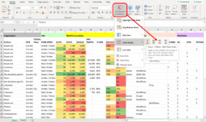
How to change the colour of a cell based on the information within it.
Conditional Formatting is an Excel feature which allows you to change a cell’s colour based on the information within the cell. For example, it is possible to use colour to grade the numbers in a selection to show their position within the range. Colour coding commonalities or outliers between different rows or columns in Excel will help you quickly identify information that is important to you.
In order to achieve this, highlight the group of cells you want to colour code, then choose Conditional Formatting from the Home menu. Next, select your logic from the dropdown (you can also create your own rules if you want something different). A window will appear that asks you to provide more information about your formatting rule. Select OK when you are done and you will see the formatting automatically applied.
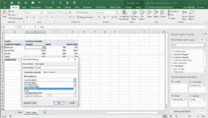
Using pivot tables to make sense of large datasets.
A pivot table is a tool that helps you display data from a dataset in different ways. They will not change the data that you have, but they allow you to sort and analyse different information across your worksheet so that you can identify patterns and trends.
A key benefit of pivot tables is that they are quick to make and easy to use. There is no need to learn complex formulas and you can rearrange the information being displayed using the drag-and-drop tool. An important advantage of pivot tables is that they will help you achieve more accurate results when filtering and sorting your data. Pivot tables significantly reduce the need for manual inputs and human error.
There are many ways a pivot table can help you organise, analyse, and summarise data. Here are some typical examples:
- Comparing values: You can compare the values by calculating sums across a spreadsheet with multiple rows and columns. For example, show the revenue breakdown from ticket sales of specific events or shows.
- Counting rows: Pivot tables allow you to count rows without having to do it manually. For example, find out how many users on your email database have opened an email across a specified period.
- Finding percentages: You can use a pivot table to find the percentages of all your values automatically instead of having to use a formula.
To create a pivot table, first select your data source and then go to Insert> Pivot Table. If you are using an older version of Excel, you would go to Data> Pivot Table. Excel will automatically populate your Pivot Table in the area you specified. You can now arrange the fields in your pivot table to display the data you want to analyse.
PRO TIP: This article has only scratched the surface regarding the power of pivot tables. If you are interested to learn more about them and how they can make your life easier, I would recommend reading this comprehensive article by Lumeer – Pivot Table Complete Guide
What’s next?
The Digital Culture Network is here to support you or your organisation. Our Tech Champions can provide free 1-2-1 support to all creative and cultural individuals and organisations who are in receipt of, or eligible for, Arts Council England funding. If you need help or would like to chat with us about any of the advice we have covered above, please get in touch. Sign up to our newsletter below and follow us on Twitter @ace_dcn and LinkedIn for the latest updates.
Request a free 1-2-1